
[ad_1]
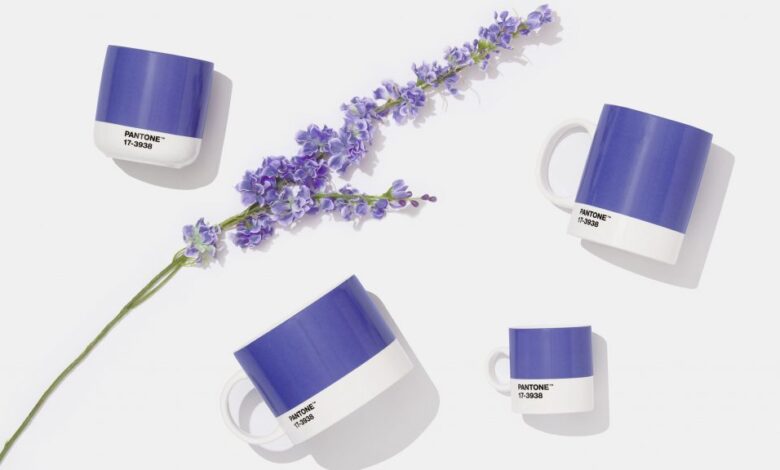
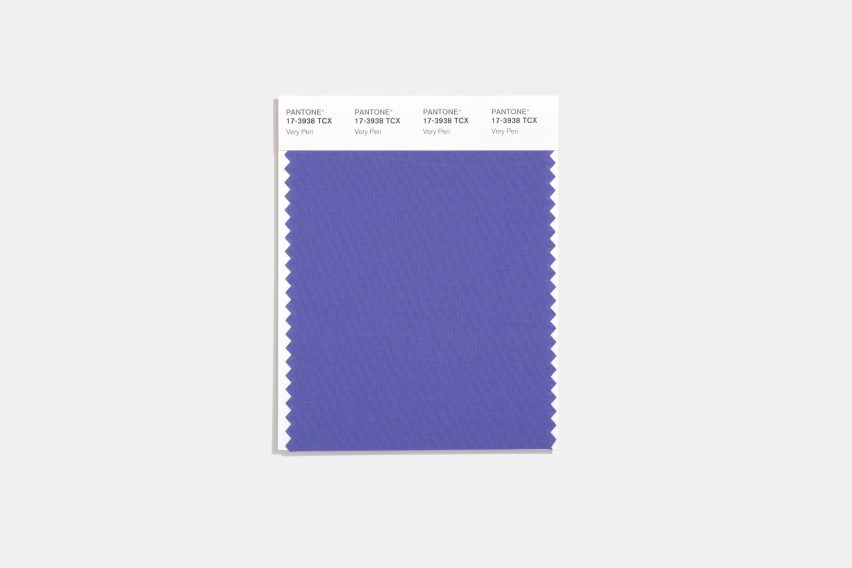
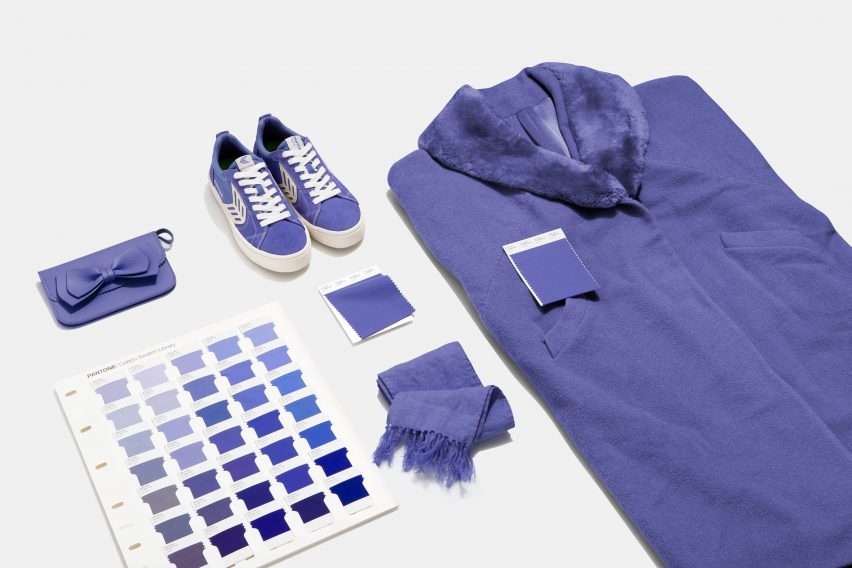
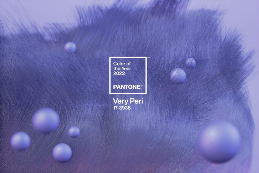
Very Peri, described by colour company Pantone as “a periwinkle shade of blue,” has been named colour of the year for 2022. The purple hue was informed by the rise of the metaverse, as well as the impact of coronavirus lockdowns.
Pantone, the company that sets one of the most widely recognised colour standards, says that the colour marries the “constancy” of traditional blue with the “energy and excitement” of red.
“As we move into a world of unprecedented change, the selection of Pantone 17-3938 Very Peri brings a novel perspective and vision of the trusted and beloved blue color family,” said Leatrice Eiseman, executive director of Pantone’s Color Institute.
“Encompassing the qualities of the blues, yet at the same time possessing a violet-red undertone, Pantone 17-3938 Very Peri displays a spritely, joyous attitude and dynamic presence that encourages courageous creativity and imaginative expression.”
For the first time this year, the brand decided to create a new shade that wasn’t already in its existing catalogue of colours for its colour of the year. To do so, the company blended blue tones with a violet-red.
The resulting Very Peri is similar to colours commonly found in nature, such as lavender flowers and birds with light purple plumage.
According to Pantone, Very Peri is indicative of the current physical and digital landscape. The American company cites the rise in the metaverse and the impact of coronavirus lockdowns as key elements that have informed the colour choice.
“Pantone 17-3938 Very Peri is a symbol of the global zeitgeist of the moment and the transition we are going through,” the brand explained.
“As we emerge from an intense period of isolation, our notions and standards are changing, and our physical and digital lives have merged in new ways.”
Since 2000, Pantone has chosen a Color of the Year. Its research arm, the Pantone Color Institute, conducts trend-forecasting research to inform its decision.
Last year, the brand broke with tradition and selected two tones as its colours of the year. Ultimate Gray, a simple grey colour, and Illuminating, a cheerful yellow, were its choices for 2021.
A royal blue called Classic Blue was chosen the year prior, for its “universal” appeal. To mark the announcement, we rounded up six interiors that made use of the bold colour.
[ad_2]