[ad_1]
The minimalist interior of this Montreal oral surgery clinic by local studio Appareil Architecture “adopts a residential aesthetic” to help patients and employees feel relaxed.
The Maxillo Tandem clinic in the city’s Technopôle Angus neighbourhood provides maxillofacial surgery, which deals with diseases, injuries and defects of the mouth, teeth and jaws.
The clinic’s founder, surgeon Anne-Frédérique Chouinard, gave Appareil Architecture a “carte blanche” to design the space differently to typical medical facilities.
“The clinic adopts a residential aesthetic with durable materials to create an inviting, refined space that centers on well-being,” said the studio.
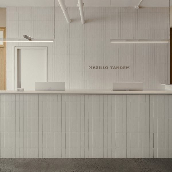
Upon entering, patients are met by a reception desk clad in vertically laid, off-white ceramic tiles that also cover the wall behind.
“Their vertical positioning adds texture and rhythm to the wall, bringing the space to life, while remaining functional and easy to maintain,” Appareil Architecture said.
The waiting area to the left is furnished with built-in seats that form a U shape around the perimeter and under a large window, while a double-sided island in the central adds additional seating.
Polished concrete flooring and beige walls complement the pale upholstery and linen curtains, together creating a serene atmosphere.
“All lend a reassuring character to the space,” said the architects. “In addition to a soft, peaceful colour palette, these materials contribute to the soothing, comforting ambiance.”
On either side of the symmetrical reception counter, oak-framed doors with fritted glass panes both lead through to the treatment area.
A central block of rooms for staff – also wrapped in the off-white tiles – runs back from the reception area, dividing the clinic into two sides.
“This central structure naturally delineates the space, creating an efficient traffic flow that allows people to move easily in both directions,” the studio said.
The corridors continue the white and wood material palette and provide access to the dentists’ offices on the left side and operating rooms along the right.
All of these rooms are also sparsely furnished and have a clean aesthetic, and are purposefully placed away from the reception area for patient privacy.
At the back of the clinic is a space with a communal kitchen for employees to take breaks, which is oriented to enjoy afternoon light.
“In the morning, the dentist’s offices, positioned on the window side, are flooded with natural light,” said Appareil Architecture.
“In the afternoon, this light pours into the staff areas and illuminates the central structure,” the team added.
A wood-panelled wall topped with clerestory windows incorporates the staff kitchen facilities and storage, while a concrete island with rounded ends incorporates a cylindrical structural column.
Since Maxillo Tandem is part of an ecological real-estate project, the architects had to comply with strict energy efficiency targets, on top of meeting the medical operating standards.
Overall, the clinic has been well-received by both patients and staff, according to Chouinard. “The customer feedback is very positive,” she said. “They feel like they’re in someone’s home, rather than a clinic. That was my intention.”
Appareil Architecture has applied its minimalist style to many residential projects in and around Montreal, including an updated 1960s home, a stark dining extension to a city residence and a black metal cabin hidden in the forest.
The studio has also designed a handful of more colourful interiors for hospitality spaces, such as a cafe and artist workshop in the city, and a restaurant inside a former factory.
The photography is by Félix Michaud.
Project credits:
Client: Anne-Frédérique Chouinard
Contractor: Hub Construction
Woodworking: Blitz Design
Reception counter lighting: Lambert & Fils
Kitchen island: Béton Johnson
[ad_2]

