[ad_1]
Design agency Aruliden has created a retail space for fashion brand Jonathan Simkhai in New York City, translating cut-out shapes from its clothing into architectural partitions and furniture.
For New York-based womenswear brand Jonathan Simkhai, Aruliden designed a temporary installation within the space on Mercer Street in SoHo – a prime shopping area in Lower Manhattan.
The geometric shapes and signature cut-outs of the brand’s clothing were translated into a variety of spatial interventions and furniture pieces, creating a store in which the brand can present new collections and host events.
“Translating Simkhai’s identity into a vision for a spatial environment required a clear and strategic idea that was not just shoppable, but also memorable and visually iconic,” said Aruliden‘s senior director of industrial design Erik Kreider.
“We wanted visitors to be fully immersed in this world, but at the end of the day it was also important that we celebrated and showcased the products the right way.”
Towards the front of the building, a double-height space is painted entirely white and further brightened by the glass facade.
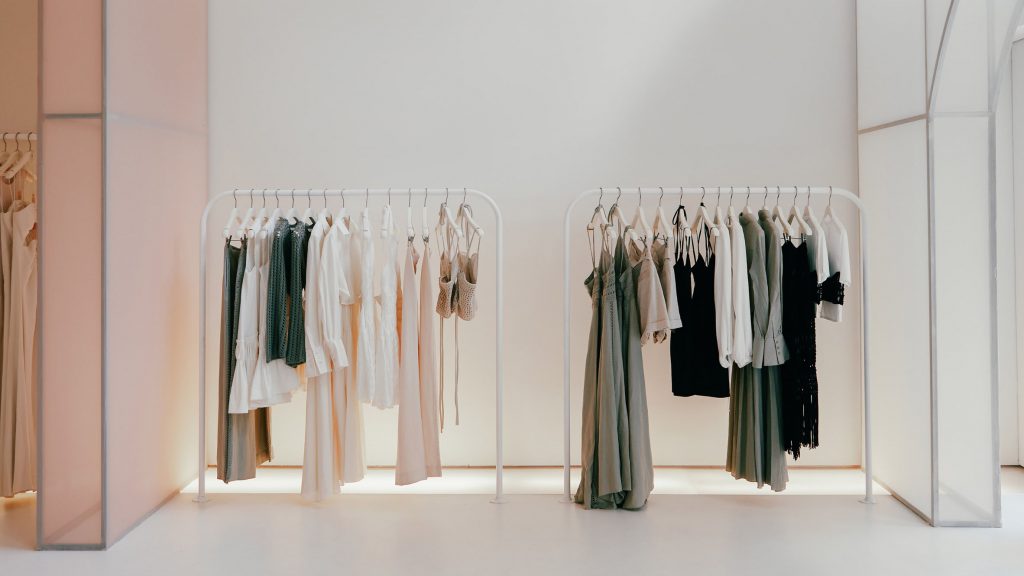
This long, narrow room is divided by a series of tall structures, comprising translucent fabric stretched over metal frames.
Fitted around existing architectural elements, the temporary walls wrapped in white, peach and pink fabric are punctured with archways that curve asymmetrically at the top, forming a passage from one end of the store to the other.
Shoppers are led through the archways and down a flight of stairs, flanked by mannequins positioned on larger steps along one side.
On the lower level, where the ceiling height is considerably lower, podiums for displaying products and decorative accessories are shaped similarly to the archway cut-outs.
At various sizes and heights, these beige-toned units form a flexible display system that can be moved around when needed.
“Clothing and products break the cadence of the fabric arches,” said Kreider.
“Together with the graphic cutouts, this creates a natural flow to the back area where more products, seating and changing rooms are located,
Throughout the store, garments are presented on identical sets of hangers along minimal white rails.
The minimalist interior is also enlivened by simple floral displays, presented in a variety of crafted vases.
Aruliden, which was founded in 2006 by Rinat Aruh and Johan Liden, is headquartered in New York City with offices in San Francisco and Amsterdam.
The agency has several products shortlisted for this year’s Dezeen Awards, including the Whoop 4.0 fitness wearable and the Series One Desk 27 video-conferencing device. It has also designed a series of mirrored structures to be built in a forest in Ontario, Canada.
The photography is by Sharon Radisch.
[ad_2]

