[ad_1]
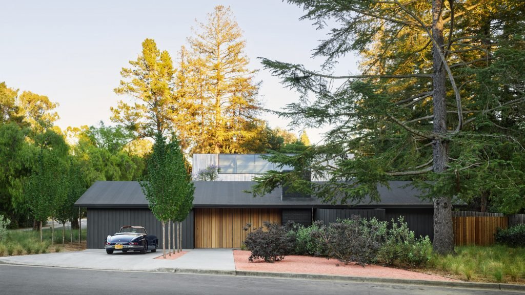
US studio Jensen Architects has updated and expanded a mid-century residence on the Stanford University campus that belongs to David Kelley, who helped start the global design firm IDEO.
Designed in 1963 by American homebuilder Ditz-Crane, the ranch-style house is located within a faculty residential enclave on the Stanford campus in northern California.
Kelley – who co-founded IDEO in 1991 with Bill Moggridge and Mike Nuttall – is a professor in Stanford’s engineering school.
“This reimagined home represents a fresh departure for the design visionary as he immerses himself in a different mode of living – one that’s on campus, bikeable, and centered around a life of exploration and exchange,” the team said.
To oversee the remodel, Kelley turned to San Francisco’s Jensen Architects – which has designed offices for IDEO – and artist and designer Johanna Grawunder, who was a partner at Sottsass’s design firm.
While conceiving the design, they focused on Kelley’s day-to-day activities while also questioning the suburban vernacular.
In turn, they pared the home back to its primary lines and incorporated new elements that act as “subtly disorienting counterpoints”.
The team set out to renovate the original home and add a studio in the rear.
The main, 2,855-square-foot (265-square-metre) home consists of single-storey, rectilinear volumes organized around a central courtyard.
For the exterior walls, the team kept the original plywood siding but gave it a fresh coat of paint.
“From the street, the house is curiously simple at first glance – a stealth ranch-style home painted shadow grey,” the team said.
A pivoting front door leads into a breezeway and toward the courtyard. Sliding glass doors along the courtyard provide an indoor-outdoor connection.
“The courtyard, once closed off from the house, is now the place where Kelley receives visitors, hosts meetings or reads in solitude,” the team said.
Within the home, the team simplified and opened up the layout.
Communal areas – a kitchen, dining area and living room – are found in the centre and rear of the house, while bedrooms are found in the front and west side. A workshop and garage are located in a volume on the east.
Interior finishes include wall slats made of Douglas fir and flooring made of wooden piers from San Francisco’s old Transbay Terminal. The interior design allows for the display of art and other objects.
“Minimal details and neutral finishes anticipate an evolving composition of Kelley’s art and design collection, including custom pieces by Ettore Sottsass,” the team said.
Just behind the main home is the 925-square-foot (86-square-metre) studio building, which is meant to be “a raw and tough space that is ready for anything”.
The tall addition has a rectangular plan, sculptural form and cedar cladding. Inside, the 25-foot-high space is lined with shelving, with a ladder offering access to upper shelves.
The addition was initially designed as a steel-and-glass box with a flat roof, but the local planner required wood siding and a gabled roof.
“Our instinct was to look at the historic context of the vernacular gable roof in North America through a contemporary lens,” the architects said.
“We blurred the boundary between wall and roof, composing sloping planes clad in a wooden rain-screen and punctuated by a large, flush-glass clerestory.”
Landscape architects Surfacedesign planted trees, hedges, cacti and grasses to help create privacy and complement the surrounding redwood trees. Out front, the landscaping is meant to help distinguish the home from its suburban context.
“The landscape counters the traditional front yard with a playful, imaginary world composed of low-water plantings and permeable areas of gravel,” the team said.
The project has a number of sustainability features, including passive cooling, cross ventilation and natural light. In the courtyard, a custom, UV-rated canopy provides shade on hot days.
Other projects on the Stanford University campus include Klopf Architecture’s full renovation of a split-level house dating to 1962. The studio replaced redwood cladding, added large stretches of glass and reconfigured the interior layout.
The photography is by Matthew Millman unless otherwise noted.
Project credits:
Architecture: Jensen Architects
Collaborating designer: Johanna Grawunder
Contractor: Donecho Construction
Landscape: Surfacedesign
Structural engineer: Strandberg Engineers
Geotechnical engineer: Murray Engineers
Civil and land surveyor: Nterra Group
Building envelope: Blanco Architecture
[ad_2]

