Superhero Animation Effect with SVG Filters
[ad_1]
From our sponsor: Guide customers along the path to purchase with our award-winning platform. Starting at $14.99/mo.
Superhero stories have captivated us for decades — from the fantastic worlds and characters of comic books, to the spectacular visual effects that help bring them to life in movies. In this tutorial, we’ll take inspiration from that and learn how to create and animate a superhero-like illustration effect for the web. Well, of course we don’t have the super powerful tools of big Hollywood studios available for us in our browsers, but worry not, SVG filters and masks will come to the rescue! ?
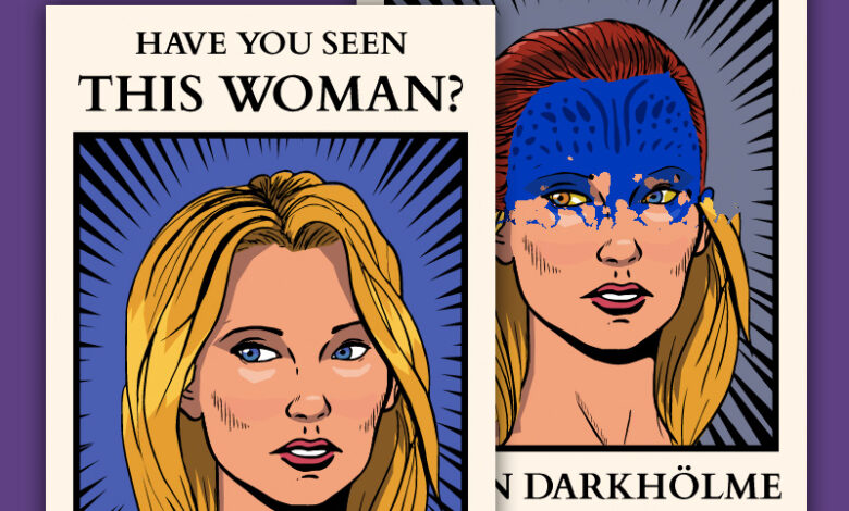
We’ll learn how to recreate this cool mutant transformation effect. In case you’re not familiar with her story, Raven Darkhölme, better known as Mystique, is a shapeshifter character from the X-Men franchise. She has a natural navy-blue skin and can manipulate her body to turn into pretty much any person she wants. That’s certainly a useful ability for running away in disguise, something that she does quite frequently. So, to add an intriguing backstory to our project, she’s portrayed in a classic-style wanted poster.
To prepare the illustrations, we’ll use Inkscape 1.1, a free open source vector drawing editor that you can download here. You can use any other vector drawing editor that you prefer. Just keep in mind that the steps will most likely be different. You also need to have at least an intermediate level of HTML, CSS and JavaScript knowledge and be familiar with GSAP, the library we’ll be using for animations.
Contents
One last thing before we start
As of now, animated SVG filters usually work better in Chrome than other browsers. Keep in mind that they can also slow down the page significantly. SVG filters are convenient and easy to use, but consider using WebGL if performance is a concern, since it’s GPU-optimized. Codrops has lots of resources about it.
How to prepare a vector illustration for the web
Inkscape is a powerful vector graphics editor full of advanced features for illustration and digital art. Plus, it’s a convenient tool to work with SVGs in a visual way, instead of writing all the code from scratch ?. We won’t really cover the illustration process in Inkscape in detail for this tutorial, but you can learn more about it from the official documentation.
Creating the drawing
Ok, let’s get started. Follow Inkscape’s quick setup guide and it will get you to an empty canvas screen. Head over to File > Document Properties in order to set the page size and units. It’s important to use pixels instead of millimeters or inches, since it’s a lot easier to work with pixels on the web.

From there, all you need to do is create your illustration using Inkscape’s tools, drawing everything using shapes and curves or importing other images to compose them on the screen. For this illustration in particular, I used Procreate on an iPad to draw the lines and imported them as PNGs into Inkscape with File > Import. Then, I used Path > Trace Bitmap to generate a high quality vector drawing from the PNG and colored by manually tracing basic shapes behind the lines. The final result was a composition of 4 different pieces: the background, foreground, mystique in her natural blue form and mystique in a transformed human form.

Exporting an optimized SVG
Once your illustration is complete, it’s time to export the SVGs. Each one of the pieces of the composition should go in its own file, since they’ll be combined on the page. ⚠️ Attention: Using Inkscape’s or your preferred editor’s native format on the web is not a good idea. These formats usually add extra data to the output that is not interpreted by browsers and just ends up making the file unnecessarily bigger.
Luckily, Inkscape comes with a super handy File > Save as... > Optimized SVG option that produces a much smaller SVG. On the export panel, it’s important to check SVG Output > Enable viewboxing, in order to make the images easier to position with CSS. The remaining defaults options are fine, but I’d encourage you to experiment a little bit with them too.

If you’re really serious about optimizing your assets, using SVGO is a must. It’s available as a command line tool and web interface on the super neat website SVGOMG. Once again, I recommend you enable Prefer viewBox to width/height to make positioning and sizing more flexible. I also recommend Prettify markup in case you intend to edit the exported code manually, it makes the output more readable.
Markup and Style
Let’s start with a very simple HTML5 page structure with index.html, style.css and index.js files and an images directory to store all the exported SVGs. Starting from a very simple HTML5 page, we import our stylesheets in the head and the script at the bottom.
<!DOCTYPE html>
<html lang="en">
<head>
    <meta charset="UTF-8">
    <meta http-equiv="X-UA-Compatible" content="IE=edge">
    <meta name="viewport" content="width=device-width, initial-scale=1.0">
    <title>Mystique</title>
    <link rel="stylesheet" href="style.css">
</head>
<body>
    <svg class="picture" viewBox="0 0 196 296">
        <rect id="bg-color" x="0" y="0" width="100%" height="100%"
						fill="#4a5eb2"/>
        <image id="background" x="0" y="0" width="100%" height="100%"
            href="images/background.svg"/>
        <image id="transformed" x="0" y="0" width="100%" height="100%"
            href="images/transformed.svg"/>
        <image id="mystique" x="0" y="0" width="100%" height="100%"
            href="images/mystique.svg"/>
        <image id="foreground" x="0" y="0" width="100%" height="100%"
            href="images/foreground.svg"/>
    </svg>
		<script src="index.js"></script>
</body>
</html>
In the body, we have a single SVG element with viewBox=“0 0 196 296”. The viewBox parameter of an SVG file defines the cropping region of the image, the first two numbers are the top left point coordinates, and the two last, the width and height, respectively. We have to use the same size we defined back in Inkscape. Next, we import the images using <image> tags, each one of them positioned on the top left (x=“0” y=“0”) and filling the entire viewport (width=“100%” height=“100%”). Behind everything, we have a rect with the color we want for the background. It’s important to give each element its own id for organization.
Styling is quite simple, a full page container with display: grid helps us to get the picture aligned to the center with place-self: center. To bring everything together and finalize the composition, we add a purple gradient to the background and a drop shadow.
html, body {
  width: 100%;
  height: 100%;
  overflow: hidden;
}

body {
  display: grid;
  background: radial-gradient(at top, #5e4082, #3a124d);
  padding: 1rem;
  box-sizing: border-box;
}

.picture {
  place-self: center;
  max-width: 100%;
  height: 80vh;
  filter: drop-shadow(2px 4px 6px rgba(0, 0, 0, 0.5));
}
The result should look like similar to the picture below. Both images are overlapping each other, but that’s ok, we’re going to use masks to create the sliding effect.

Setting up svg masks ?
SVG masks are elements that define the transparency of the masked objects according to the color value information inside them. If a pixel of the mask is white, the corresponding pixel of the masked object will be visible; if gray, it will be partially transparent; and in case it’s black, it will be fully transparent. Everything outside the mask region will also be fully transparent. Hopefully, the diagram below will help you understand better how masks work:

To define the mask, we add a <defs> element to the top of the SVG, with two <mask> tags inside it. One will be used to mask mystique (id="mask_mystique"), the other will be used for her transformed version (id="mask_transformed"). Each mask contains just a simple white rectangle with enough size to cover the entire visible area. Then, we apply the masks to their corresponding elements, using the mask="url(#mask_id)" attribute.
<svg class="picture" viewBox="0 0 196 296">
    <defs>
        <mask id="mask_mystique">
             <rect class="mask" x="0" y="-100%" width="100%" height="100%" fill="white"/>
	</mask>
	<mask id="mask_transformed">
             <rect class="mask" x="0" y="0" width="100%" height="100%" fill="white"/>
	</mask>
    </defs>
    <rect id="bg-color" x="0" y="0" width="100%" height="100%" fill="#4a5eb2"/>
    <image id="background" x="0" y="0" width="100%" height="100%" href="images/background.svg"/>
    <image id="transformed" x="0" y="0" width="100%" height="100%" mask="url(#mask_transformed)" href="images/transformed.svg"/>
    <image id="mystique" x="0" y="0" width="100%" height="100%" mask="url(#mask_mystique)" href="images/mystique.svg"/>
    <image id="foreground" x="0" y="0" width="100%" height="100%" href="images/foreground.svg"/>
</svg>
Mystique’s mask is positioned at y="-100%", which means that it’s outside and above the viewport, hence, she will be fully transparent. Meanwhile, transformed Mystique’s mask is covering the entire viewport in white, which means that she will be fully visible. If we moved both masks 50% to the bottom, the resulting effect would be both versions of mystique being partially displayed on the screen, like the illustration below.

y="-100%", which means that it’s outside and above the viewport, hence, she will be fully transparent. Meanwhile, transformed Mystique’s mask is covering the entire viewport in white, which means that she will be fully visible. If we moved both masks 50% to the bottom, the resulting effect would be both versions of mystique being partially displayed on the screen, like the illustration below.Adding visual effects ✨
SVG filters are super powerful tools to add some coolness to our boring simple SVGs. There’s A LOT of different filter options that are out of the scope of this tutorial, but if you want to read more about them, Codrops has plenty of tutorials explaining each one in detail.
Now, let’s move on to the code. Inside the same <defs> tag we created for masks, we add a <filter id="distort">.
<filter id="distort">
    <feTurbulence
        type="turbulence"
        baseFrequency="0.08"
        numOctaves="2"
        result="turbulence"
    />
    <feDisplacementMap
        in2="turbulence"
        in="SourceGraphic"
        scale="50"
    />
</filter>
Filters are composed of primitives that can also be stacked and composed together. To create Mystique’s cool transformation effect, we’re going to use the feTurbulence primitive, which generates a Perlin Noise pattern. The attribute type of feTurbulence controls the type of turbulence that is generated, baseFrequency controls its size and numOctaves its roughness. Then, we name the output with result="turbulence".
Next we’re going to use the output of feTurbulence and combine it with the SourceGraphic (the pixels of the object to which the filter is applied) into a feDisplacementMap primitive. This primitive deforms the content of its in parameter using the color information of in2. The scale controls the length of the deformation.
? Tip: I highly recommend you to play with Yoksel’s SVG filter playground, if you want to check out how each one of these parameters affects the output of the primitives ?.
All we have to do next is apply the filters to both masks. Since the mask rectangles will be animated, to create the flowing transformation, we want to add the filters to a wrapper group <g>. Otherwise, the filter distortion would move along with the masks statically, which would not look as cool ?.
To wrap up this section, here’s how the final SVG should look like:
<svg class="picture" viewBox="0 0 196 296">
    <defs>
        <filter id="distort">
            <feTurbulence
                type="turbulence"
                baseFrequency="0.08"
                numOctaves="2"
                result="turbulence"
            />
            <feDisplacementMap
                in2="turbulence"
                in="SourceGraphic"
                scale="50"
            />
        </filter>
        <mask id="mask_mystique">
            <g filter="url(#distort)">
                <rect class="mask" x="0" y="-100%" width="100%" height="100%" fill="white"/>
            </g>
        </mask>
        <mask id="mask_transformed">
            <g filter="url(#distort)">
                <rect class="mask" x="0" y="0" width="100%" height="100%" fill="white"/>
            </g>
        </mask>
    </defs>
    <rect id="bg-color" x="0" y="0" width="100%" height="100%" fill="#4a5eb2"/>
    <image id="background" x="0" y="0" width="100%" height="100%" href="images/background.svg"/>
    <image id="transformed" x="0" y="0" width="100%" height="100%" mask="url(#mask_transformed)" href="images/transformed.svg"/>
    <image id="mystique" x="0" y="0" width="100%" height="100%" mask="url(#mask_mystique)" href="images/mystique.svg"/>
    <image id="foreground" x="0" y="0" width="100%" height="100%" href="images/foreground.svg"/>
</svg>
Animating with GSAP
GSAP is an amazing JavaScript library for web animations. It can flawlessly handle animations from simple to complex with a streamlined API that gets the job done smoothly. We’re going to use it in our project to animate the masks rectangles. If you want to know more about how to use GSAP’s features, check out the official documentation here.
import gsap from "gsap"

const tl = gsap.timeline({
  repeat: -1, // Makes animation repeat infinitely
  yoyo: true, // Animation will go back-and-forth like a yoyo
})

tl
  .to('.mask', {
    translateY: '100%', // Move .mask elements down by 100%
    duration: 3,
  })
  .to('#bg-color', {
    attr: {
      fill: '#ffd11b' // Change the "fill" attribute of #bg-color
    },
    duration: 2
  }, '<+=1') // Start 1s after the previous animation
Looking into the code, first we import the GSAP and create a timeline that repeats back-and-forth. Next we animate the masks by translating them in the Y (vertical) axis and change the color of the #bg-color element to a #ffd11b yellow. The result should look like the demo from the intro:
Super cool! But what about adding some interactivity to make the animation follow the mouse? Mouse movement events can be tricky to work with on the web, because they’re fired very frequently, forcing the browser to compute animations way too many times ?. We can use lodash.throttle to help us ensure that the mouse move handler will not be triggered at a rate too fast. If you’re comfortable with it, you can also use the native requestAnimationFrame function, it’s perfect for throttling expensive animations like these.
import gsap from "gsap"

// We'll use throttle to make sure the mousemove event
// doesn't trigger too often
import { throttle } from "lodash"

const tl = gsap.timeline({
  paused: true, // Start at a paused state
  defaults: {
    ease: 'none' // With no easing (linear)
  }
})

tl
  .to('.mask', {
    translateY: 296,
    duration: 3,
  })
  .to('#bg-color', {
    attr: {
      fill: '#ffd11b'
    },
    duration: 2
  }, '<+=1')

const $picture = document.querySelector('.picture')

// Mouse move handler
function handleMoveEvent(ev) {
  // Get the viewport rectangle of the picture
  const rect = $picture.getBoundingClientRect();

  // Compute the relative mouse position inside the rect
  const relPos = (ev.clientY - rect.top) / (rect.bottom - rect.top)

  // Use the computed value to control the animation progress
  tl.progress(relPos)
}

// Bind the mousemove event, with a throttle to ensure it only
// triggers once at every 60 milliseconds
$picture.addEventListener(
  'mousemove', throttle(handleMoveEvent, 60)
)
This should be the final result of this project, a complete, interactive and super cool SVG super hero animation! I hope you enjoyed it and learned a bit about the superpowers of SVGs ?.
[ad_2]


