5 Website Header Design Trends for 2023
[ad_1]

There’s nothing wrong with going the classic route when it comes to website header design. Data suggests that the traditional layout with the logo on the left and the navigation on the right is and always will be an effective way to go.
That said, there are ways to maintain this long-standing and winning formula while putting a modern spin on it. While WordPress might not provide you with the tools to do much in the way of customizing your header, BeTheme’s Header Builder does:
If you’re curious to see what kind of website header trends will be popular in the coming year (and which ones you can easily create using the BeTheme Builder), keep reading.
Contents
5 website header design trends to experiment with in 2023
As web design technologies give us more control over how websites look, we’re going to see a more diverse array of design trends. In 2023, here is how those trends will transform website header design:
1. The multi-level header
Every website header must include two components: the logo and the navigation. As websites have grown to provide more information and perform more complex tasks, though, users would greatly benefit from other elements being included in the header.
By affixing additional sections to the header, you can provide visitors with the most important information and action buttons at the very top of the website.
These additional levels can create space for things like:
- Primary call-to-action button (like “Book Now”)
- Search bar
- eCommerce shopping cart and account login icons
- Website notifications and promotional messages
- And more
You can also use the multi-level header design to add secondary navigations. For instance, BeThemeStore2’s website header has four levels — one of which is a dismissable notification bar at the top of the page:

The main navigation appears below the logo where users expect it to be. They can search through different device categories to narrow down their search from here.
The secondary navigation, on the other hand, appears above the logo section. It contains pages about the company. While these types of links are often placed in the footer, the multi-level header design enables them to appear at the top without overcrowding.
Another way to make the multi-level design work for dual navigations is to do as Gap does:

When building a website for a company that has sister brands, use extra header levels to add links to those websites. This way, you can create a truly omnichannel shopping experience and users won’t have to stumble across the connection between the brands only once they’ve scrolled to the footer.
In recent years, many designers have used the footer as overflow for navigational links. It’s an effective way to save space in the header, which is great if you want to maintain a minimal design throughout each page. However, it’s not always the ideal approach, especially as web pages get longer and longer on both desktop and mobile.
One way of dealing with this is to create a multi-level header and to place the secondary links outside of the main navigation. Another option is to create a mega menu.
Mega menus used to be popular, though they sometimes ended up being clunky and difficult to use — especially as smartphones became an increasingly popular way to access the internet. Mega menu design has gotten much better today and we’re going to see them make a big comeback in 2023.
News sites, retailers, and enterprises with dozens of pages that need to be front and center will make use of this design trend. Urban Outfitters is one such website currently using a mega menu design:

Modern mega menu headers will be cleaner and better organized than their predecessors. What’s more, they’ll be more visually pleasing to look at with promotional graphics included within them.
BeFurnitureStore is another website that demonstrates how to pull off this header design trend:

It’s up to you to determine how much information to include in the mega menu. Just be careful about how many clicks you ask your visitors to make. Generally, the mega menu should go no more than two or three levels deep.
3. The left-aligned header
Internet users’ eyes are naturally drawn to the top-left area of a website (or right on websites published using right-to-left languages like Arabic or Hebrew). This is why the logo is commonly placed in the corner. Not only does it strengthen brand recognition, but it makes navigating back “Home” an intuitive task for all users.
While the horizontal header at the top of the page is the common way we see the logo and navigation presented, we can also turn the header on its side and make it vertical. So long as we have the logo in the top corner, our visitors’ eyes will naturally pivot around it to find the navigation.
While this layout usually doesn’t work for larger websites, it’s a creative and unique way to design the header on smaller websites — like for local restaurants, event companies, services providers, and so on.
For example, here’s how the left-aligned header design looks on the BeEvent7 website:

The nice thing about the left-aligned header and navigation is that it’s always present. This way, it won’t matter how long the page gets. Visitors won’t have to scroll through your content in order to re-engage with the header at any point.
This will come in handy with a portfolio website like Dylan Perlot’s:

One thing to keep in mind with this header layout is that it’s not inherently responsive. So it will need to be converted into a hamburger menu for smaller screens.
4. The minimal content header
This trend is another way in which you can design the header for smaller websites. Rather than leave every part of it on full display, the minimal content header will tuck the navigation (and secondary elements like the search bar) away under a hamburger menu icon.
As more and more people spend time browsing the web from their phones, their familiarity with the hamburger icon has grown. In turn, this navigation icon can now be used on larger screens without creating usability problems.
Typically, the minimal content header is presented with just a logo in the left corner and a hamburger icon in the right. When the icon is clicked, the navigation appears as a dismissible sidebar. You can see an example of this on the BePortfolio2 site:
Another way to handle this is by turning the menu into a fullscreen pop-up as Kellogg’s does:
If you compare the BePortfolio and Kellogg’s examples, you’ll get a good idea of which to use for the type of website you’re building.
For smaller websites, a less intrusive sidebar menu header would look good. However, if your users need to spend more time in the navigation (like if it’s a mega menu), then a fullscreen pop-up that hides the main website UI would be best.
5. The transparent background header
The website header is its own section. However, just as different sections on our web pages don’t need clearly defined borders in order for visitors to recognize where one starts and another ends, the header doesn’t need them either.
Something we’ll see more of next year will be transparent header design. This will give websites a more open feel as the header blends into the rest of the content.
The one thing to be careful of when removing the solid background from the header is color — be it a solid color background, image, or video. In order for the website header elements to be easy to locate and use, they need to be visible at all times, so color contrast is important.
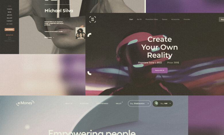
One way to avoid any contrast issues is to make the header solid when the visitor scrolls. You can see how this works on the BeVR website:
Another website that uses this transparent header scrolling effect is e-Money:
While this transparent-to-solid effect works, you can always choose a header font color that stands out against your background. You’ll have the most luck with this when your web page background is the same color throughout.
Make a strong impression with website header design
While WordPress themes are indispensable web design tools, until recently there have been limitations on how much of a website they allow us to customize. But that’s all changing with the BeTheme Header & Mega Menu Builder.
One thing to keep in mind is that just because you have the ability to fully customize the website header design, that doesn’t mean you should break all the rules. If you look at these 2023 trends, you’ll see that good website header design principles persist.
So as you experiment with header customization, find a good balance. Flex your creative muscles as you add more information to the header and make it more visually engaging, but never forget the general structure that users have come to know and appreciate.
[ad_2]


