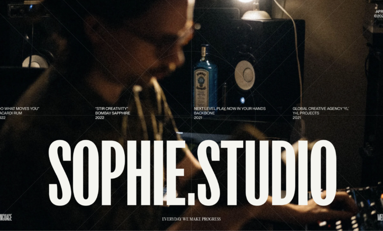
Case Study: Sophie Studio
[ad_1]

From our sponsor:
![]()
![]() Create stunning brand assets with the help of our AI-driven Creative Assistant. Get started today.
Create stunning brand assets with the help of our AI-driven Creative Assistant. Get started today.
At Sophie Studio, we are a team of creative professionals who love pushing boundaries and staying ahead of the game. We take pride in our expertise in various projects and the recognition we’ve received both domestically and internationally. So, we’re excited to share with you our new website that showcases the values and purpose behind our work in a unique way.
We’ve put a lot of love and care into our website content to make sure that it’s engaging, immersive, and reflective of our passion for creativity and excellence. This website is not just a tool to display our work, but a way to share our story and show our growth as a team. We’re thrilled to show you some of the highlights of our website design, which demonstrate our commitment to innovation and pushing the limits. So, come on in and take a look around, we hope you love it as much as we do!
Contents
The Gaming Interface: A Unique Perspective
Most website agencies and studios have traditionally relied on the basic website format, which is a long vertical scroll downwards.
However, for our website, we decided to adopt a gaming interface as our core concept. With a fixed screen layout resembling a gaming controller, we aim to provide a fresh perspective on how people view traditional websites. Our website design focuses on an interface that resembles a game status screen, such as an inventory screen, allowing users to view the “Sophie Studio” status screen in a unique way.
From a site update perspective, we’ve incorporated the idea of leveling up in games, where additional skills and stats are added as the level increases. As a result, the site’s overall design emulates the experience of playing a full-screen game, starting with the opening game development company logo, followed by the title screen, and extending to menus, transitions, and screen layouts.
Our goal is to provide users with an immersive gaming-like experience, making it feel as if they are playing a game while browsing our website.
Mosaic Animation: Adding a Fun Element to the Key Visual Area
We used a mosaic animation similar to what is used in games to add a fun element by changing the key visual area.
The mosaic animation is created using 2D canvas. We start with small images for the mosaic and gradually decrease the size until the mosaic is at its smallest, at which point we display the original image.
Before using fillRect, we use Math.random to determine whether or not to draw the current mosaic in its current position. If we don’t draw the current mosaic, we define that the previous mosaic should be drawn, creating an effect that looks like the mosaics are sliding horizontally.
The menu navigation is designed to open like an inventory menu in a game, rather than the current mainstream style of a hamburger menu. The transitions also enhance the fun of opening the menu with animations that are not typically seen on websites. In addition to the main link elements, the user experience is enhanced through music settings, language switching, accessibility options for dark mode/light mode, and even keyboard shortcuts to eliminate mouse operation, allowing for a seamless and game-like operation feeling while browsing the site.

Seamless transitions between pages are achieved through conditional branching between the previous and current pages, utilizing effects such as the basic triangle effect and zoom effect for navigating between the works list and detail pages, adding essence to the simple layout.
Additionally, the zoom effect when returning from a works detail page to the list page is designed to store the scroll amount as a variable, and restore the original position based on that variable when transitioning back to the list page from the detail page.
Discovering Client Achievements in a Creative Way
On the ABOUT page, we have designed the presentation of our extensive list of client achievements in a way that is not just redundant and simply displayed as a list, which may not look beautiful. Instead, we have come up with a creative solution that allows viewers to hover over the client list and see fragments of the projects we have been involved in, creating an enjoyable experience of exploring the archives. We have cleverly designed the archive of prestigious major client achievements to look visually appealing.
Typography: A Blend of Modern and Retro
While creating a gaming interface, it’s not enough to simply apply a digital aesthetic to all elements. Therefore, the key was to figure out how to blend modern typography with a gaming digital style. By mixing a modern, slightly retro font with mosaic animation and hover effects reminiscent of games, we were able to cleverly inherit retro elements while maintaining a modern design.
[ad_2]


